
Start Following These 5 Best Practices For Using Call-to-actions That Help In Increasing Conversions.
Are you not getting enough conversions from your website?
Tried everything but still not working? Have you tried to optimize your Call-to-Action(CTA) buttons? Read on…
 What is a Call-to-Action Button?
A Call-to-Action is a button, a link or a banner that is placed on a web page or a landing page with a purpose of prompting the user to click it. The aim behind it is to convert a visitor into a lead and enter the conversion funnel to eventually get a sale. Call-to-action button are linked to another page for soliciting action from the user in exchange of a reward.
The Call-to-Action buttons usually are placed to either ask for a sign-up or for downloading an eBook or even to make a purchase. When the user takes an action by clicking on it and submitting information, if asked, gets rewarded with the mentioned entity which can be an eBook, a free trial and more depending upon the purpose.
What is the need to optimize Call-to-Action (CTA) buttons?
Imagine, if there were no CTAs on websites. How would you guide your visitors to take an action?
With so much text and too many images, it would be difficult for the users to find one clickable link that could make or break your sale.
Every element on a web page has a unique role and so does a CTA. This tiny button has a power to ruin any online business, if not used correctly.
At the end of the day, a business is all about conversions and a CTA is a conversion point that can help you in getting more leads as it is the link between content and your prospect. Thus it becomes very important to optimize it for best results.
Call-to-Action best practices
If you want more visitors to convert, it’s time to tweak your CTAs a little with a lot of careful planning. Make sure you follow these best practices and tips to create great call-to-actions.
1. Size it perfectly – A CTA needs to grip attention of the visitor and for that it needs to be bigger than the rest of the buttons on the webpage. Making it too large is not the solution as it will overpower other elements and will shift focus from the content.
2. Don’t forget the color – This is a no brainier. Your CTA must have a color that stands out from the rest of the elements. It is important to make your CTA bright otherwise how will it get hold of user’s attention? There’s no need of a CTA if you will eventually blend it with your site. Give your CTA a color that contrasts the theme of your site to make it look as if it is jumping out. Remember to keep it eye-catching.

3. Don’t place it just anywhere – Only 47% of Fortune 500 company’s websites have a clear call-to-action button that takes users 3 seconds or less to see (ref. – Go-Globe)
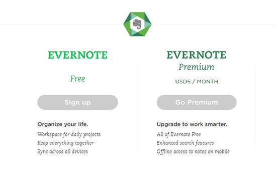
Placement of a CTA plays a major role in conversion rate optimization. While it is a good practice to place your CTA above-the-fold, you must not follow it blindly. If you have a long landing page, it is suggested to repeat the use of CTA so that you don’t miss any opportunity to catch user’s attention.

Evernote CTA repeats below-the-fold
4. Use powerful value proposition: What you write on your call-to-actions plays a pivotal role in deciding whether the user will click it or not.
Rather than listing a bland and distrustful ‘Click Here’, use phrases like ‘ Create My Account Now’. Doing this you can convince the user that there’s no harm in clicking this button and the user develops trust.
Never dupe your audience into false schemes by making them click on suspicious links. Clearly mention what your are going to offer and stick to it.
5. Why not A/B test your CTA? : Never give up on testing. If you are having a tough time in creating a perfect CTA, don’t worry.
A/B test your call-to-actions by refining different elements of your CTA like its color, its language i.e the copy , your CTA’s placement and even the size. Test different combinations until you find the perfect one which drives your sales by increased conversions.

As you can see, it can be catastrophic to ignore your call-to-action button.
These small little buttons have the power to influence your sales and taking them for-granted will only worsen things for your business.
The next time your sales tumble down and conversions decline, think about optimizing your call-to-action buttons.
A little modification coupled with smart planning can help you get back on your feet. Just keep in mind these CTA tips we discussed with you.
I’ve selected few more articles for You from Experts, Don’t miss
Tips to Optimize Your CTA Buttons for Conversion
Mastering The Call To Action – Words, Color, Size & Location
5 Quick Call to Action Best Practices to Follow for Increased Site Conversions
E-commerce calls to action: best practice guide
Drop your valuable comments and suggestions in the comment box below. I would love to hear from you.
Share this article in your circle if you find worth sharing and do suggest them Quibus Trainings- Digital Marketing Institute in Jaipur for a perfect 3 months digital marketing course.