
The past years have witnessed a significant growth in the number of mobile users. Millions of people access the Internet using mobiles and smartphones. This has prompted the need to adapt to the changing scenario and make respective changes in the websites to increase the visitors.
The desktop version of the website may take some extra minutes to load on mobile devices. This may affect the user experience causing him inconvenience. Everyone wants to access data in a few seconds after clicking.
Delayed loading may frustrate the user and s/he may likely quit the site.

Below you are going to find answers to all your questions like. How to do mobile SEO? How does it work? How can I improve the mobile SEO of my website? What are the latest trends?
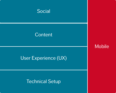
Mobile SEO optimization aims at developing a user-friendly website. It uses different tools and techniques to design a responsive website that can be easily viewed on mobile screens. The essential features which must be incorporated in an optimized website are mentioned below.
- The design must be responsive which helps the website to adjust itself according to the screen size. Responsive designs respond to the user’s behavior and give him an optimal viewing experience. For example, You can visit Quibus Trainings website. Its design adjusts according to the size of the user’s device and makes the website more clear & readable.
- The navigation across the screen must be easy. All the links and call-to-action buttons must be on the well-displayed and should function well.
- The website should load easily when it is browsed on mobile devices which have low Internet speed.
- The contents should be easily readable. The users must be able to fetch the contents without zooming or pinching the screen.
- The landing page must contain the entire essential details so that the user can access them quickly. If they are not available on the home page, the user may abandon the website.
The optimality and ranking of websites go in parallel. Higher the optimality, the higher will be the ranking of your website.
Efforts must be made to ensure that Google crawls all your web content and understand it. Once Google identifies your site as mobile it will rank in the higher search results.
Now Let’s Learn How To Optimize The Mobile Search.
1. Techniques To Make Website Mobile
These include responsive design, dynamic serving, and Mobile URLs. The website code must be updated. If you are using WordPress and other CMS, you can purchase responsive mobile templates from different theme developers such as Theme Forest, StudioPress, and Creative Market.
2. Test Mobile Friendliness
It is necessary that the Googlebot understands the web content as this boosts up the Google rank of a website. The pre-requisites are:
- Dynamic Serving: This uses the same URL to deliver different content to both desktop and mobile users. But Google cannot identify this automatically. We need to inform it that the content is being served dynamically. The Vary HTTP Header is used to state that the webpage does have a mobile version too.
- Separate URLs: If your website has separate URLs for desktop and mobile users, we need to inform Google about this. For the desktop webpages, we need to add a tag e.g. link rel =”alternate” which denotes the respective URL for mobile. Doing so Googlebot traces the location of mobile webpages. Similarly, for the mobile site, give a link rel=”canonical” which points to a desktop URL.
Also Read: Social Bookmarking sites
3. Optimization
Use the Google Page Speed insight tool to check the loading speed of your webpage. It will let you know of all the loopholes if any. Higher mobile PageSpeed will result in better Google ranking. Pop-ups and interstitial ads must be blocked to avoid user inconvenience and may cause a higher bounce rate.

There are some other facts which you need to consider for making a website mobile. Here are a few of them.
- Plan out Keywords- The Google AdWords tool should be used to do the keyword research. After the research compare the mobile ratio with the total estimate. This would give you an idea of which keywords have a higher rating.
- Titles and meta-description- Take utmost care to optimize the title and meta-descriptions. Be precise and include the essential details in the meta-data. Optimized snippets would also help bring in better ranking in the Google search page results.
- Enhance the Page Speed- You must optimize the images and code, reduce the number of redirects and have complete control on the browser caching. This would increase the page speed in case of lower bandwidth and other network problems.
- Allow CSS, JavaScript, and Images- In the earlier days, the developers blocked the CSS and JavaScript for mobile phones. But now it is necessary to include all the three as they help the GoogleBot consider the website mobile-friendly.
- HTML 5- Use HTML5 to create special effects in your website. Avoid using Flash, as the plugin may not be available on the user’s device. This way, he could miss some important data.
4. Helpful Tools
You must use the following mentioned tools to check the user-friendliness of your website.
- Google Webmaster Tool– Provides you a detailed knowledge of the guidelines and strategies that you should follow to make optimized websites.
- User-Agent Switcher– This user agent extensions are used to switch the content between different kinds of devices. The web browser displays mobile content when it identifies the mobile user.
- Responsive Design Testing tools– They are used to check the look and feel of responsive websites across different screens
Developing an innovative SEO strategy and implementing it would really do wonders for mobile search engine optimization. Once you have taken the initiative, you will certainly stand out with better Google mobile search results.
Follow the latest trends and best practices and then launch the optimized website. You will have infinite viewers on your mobile wall.
Do you have something else to share? If yes, drop them in the comment box below.